Dark Restaurant Menu Showcase
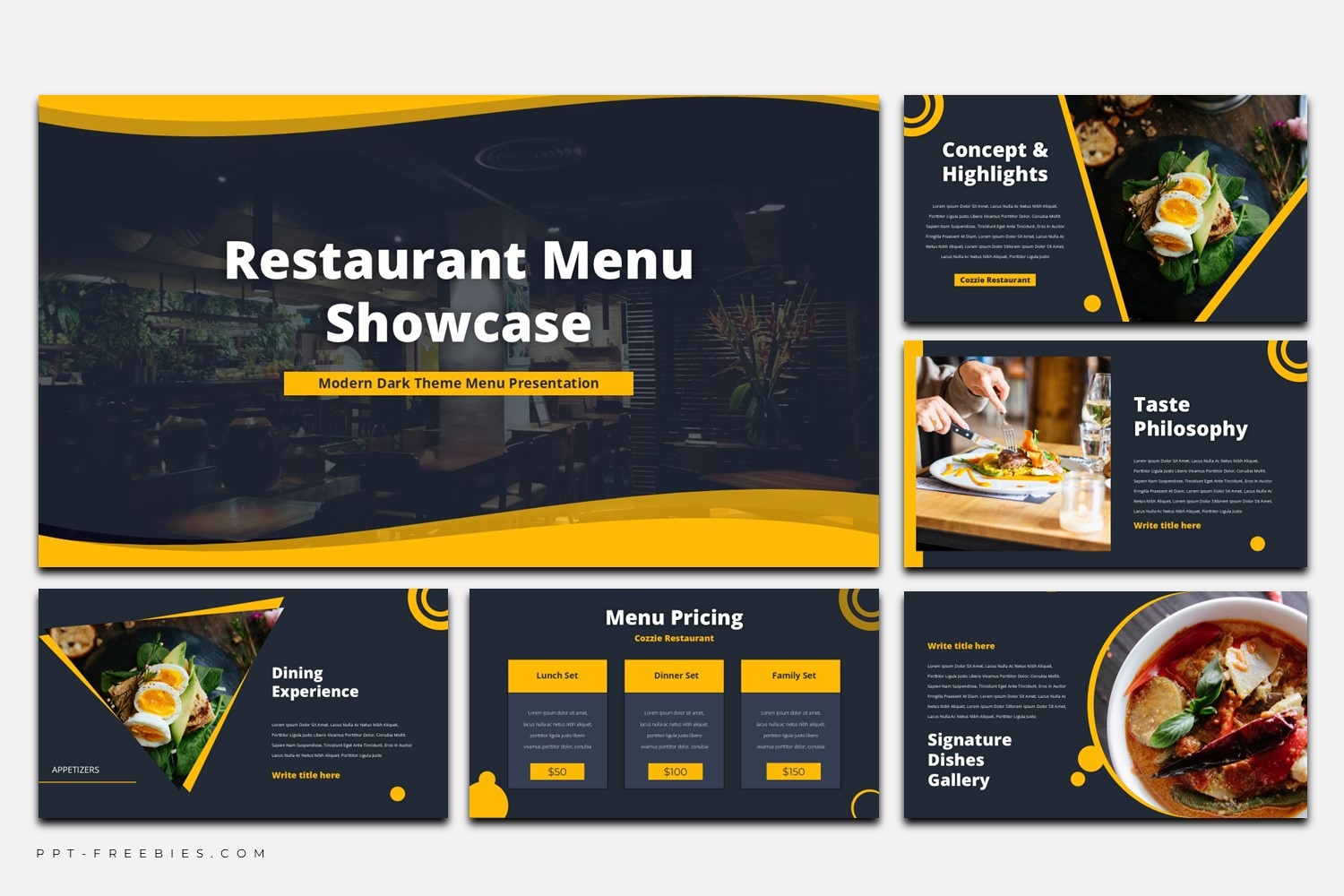
Dark Restaurant Menu Showcase is a photo-forward slide deck with a charcoal background and bold yellow accents. Use it to present your restaurant story, signature dishes, and menu highlights with gallery layouts, pricing cards, and clean section dividers.
If your menu deserves a stronger stage, this template leans into contrast and atmosphere. The slides use a dark charcoal backdrop, bright yellow highlights, and repeating corner ring motifs that tie the deck together. Food photos are treated as the main character—shown in split layouts, angled masks, and circular gallery frames—while short, bold headings keep the message clear. You’ll also find practical formats such as a three-card menu pricing slide, an infographic ribbon for steps or categories, and several quote/testimonial layouts for reviews.
One honest note: the design is built for punchy text and big visuals, so it’s less comfortable for long paragraphs.
Key Features :
- 36 slides in 16:9 widescreen
- Works in PowerPoint and Google Slides
- Dark theme with bold yellow accent system and repeating corner ring motif
- Photo-centric layouts: split screens, diagonal masks, circular gallery frames
- Includes images and download links for the fonts
- Commercial use allowed with attribution
- Strong hierarchy for restaurant storytelling: sections, highlights, quotes, and showcases
What’s Inside :
- Title / cover slide
- About the restaurant / intro layout
- Chef’s note / message slide
- Quote / testimonial slides
- Signature dishes gallery & collage layouts
- Menu highlights with 3-image blocks
- Menu pricing (3-card table)
- Infographic ribbon / step-by-step slide
- Chart slide layout
Best For :
- Restaurant menu presentations and seasonal menu launches
- Café/bistro decks that rely on ambiance and food photography
- Catering menus and event food packages
- Hospitality presentations where testimonials and signature dishes matter
- Social-media-ready menu highlights
Tips Editing :
- Keep body text short. Let headings + photos do the heavy lifting.
- Raise readability by adding a slightly darker overlay behind paragraphs when your photo is busy.
- Pick one photo temperature (warm or neutral) across the deck so the yellow accent doesn’t fight the imagery.
- Reuse the same yellow “tag” style for categories (Appetizers / Main Course / Desserts) to maintain consistency.