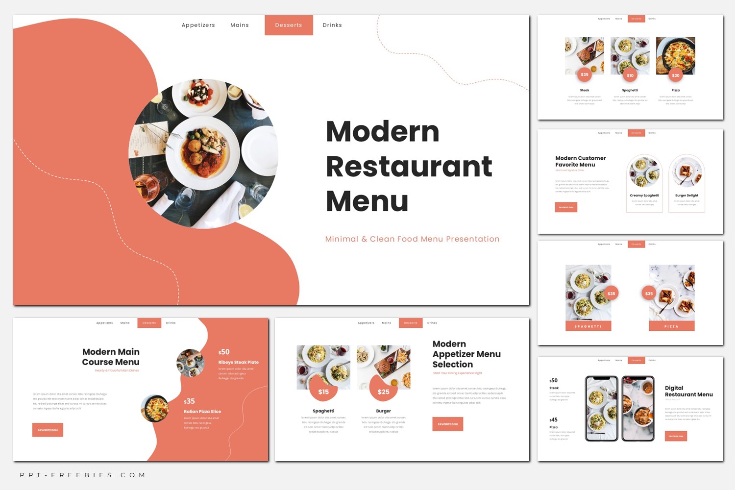
Minimalist Restaurant Menu
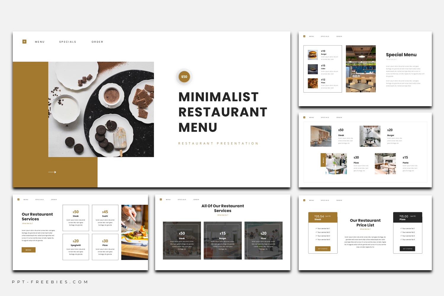
Minimalist Restaurant Menu is a 16:9 deck built around white space, warm brown accents, and photo-forward menu cards. Use it to present featured dishes, pricing, services, and brand story in a calm, upscale layout.
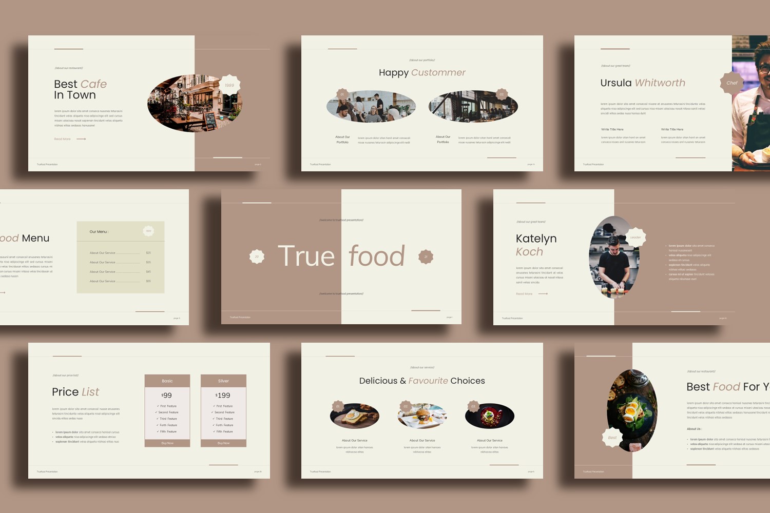
This template is designed for restaurants that want their menu to feel curated, not crowded. The preview shows a bright white base, caramel-brown accents for buttons and price tags, and plenty of spacing so each dish or section gets its own moment. You’ll also see modular menu cards, photo strips for galleries, and bold headline blocks that keep the hierarchy clear.
It’s a great fit for showcasing favorites, specials, and a simple brand story—especially when you’re working with strong food photography. One honest limitation: it’s less suitable if you need long paragraphs or extremely dense item lists on a single slide. It tends to look best for a focused selection (signature dishes) rather than “everything on the menu.”
Key Features :
- 30 slides in 16:9 (wide) format
- Works in PowerPoint, Google Slides, and Canva
- File package: PPTX + Google Slides Template Link + Canva Template Link
- Commercial use
- Includes images (as provided)
- Includes font download links (as provided)
- Minimal card system for prices, dish names, and short descriptions
What’s Inside :
- Cover slide with bold title and split photo panel
- Services or offerings overview with multiple price cards
- Menu favorites highlight with big hero photo + small price blocks
- Special menu layout with photo grid and short descriptions
- Team/profile slides with portraits + role labels
- Contact slide with icon-based details + “Thank You” closing slide
- Section divider / story slide for brand narrative
Best For :
- Restaurant menu presentations for dine-in or events
- Highlighting signature dishes, specials, or set menus
- Showcasing services (catering, private dining, seasonal offers)
- Menu/app promotion slides for digital ordering
- Brand story + team introduction in a single deck
Tips Editing :
- Keep descriptions short; the layout rewards tight copy and clear hierarchy.
- Use one photo style consistently (similar lighting/temperature) so the grid feels intentional.
- If you add more items, duplicate the existing card modules instead of shrinking text.
- Maintain contrast: dark text on white, and use the brown accent only for emphasis (prices/CTAs).